

Hi! My name is Benjamin
Web Design Student
HTML, CSS, JS, JSON
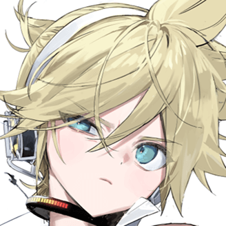
ABOUT ME
Surname : Benjamin
Name : Brihaye
Nickname : Benji
Age : 21
Birthday : November 6
Hobbies
Video games, music, reading (books and mangas), movies, YouTube, Twitch, travelling, walking
Top 4s
Movies
- Titanic
- Oppenheimer
- Alien
- Alien Covenant
Games
- Omori
- Minecraft
- Alien Isolation
- Until Dawn
Anime
- Evangelion
- Frieren
- Chainsaw Man
- Oshi No Ko
Project Janus - CallMeCarson
2024, lead designer and lead developer
The purpose of this school project was to create a website about an influencer. To make a page promoting him, then one talking about the influencer controversies and problems, and a page displaying his data.
Moodboard
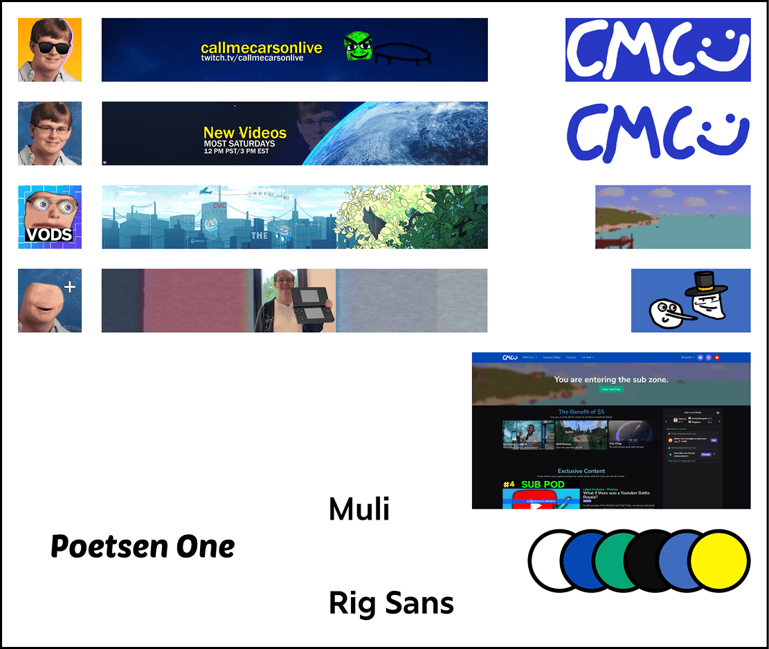
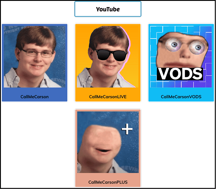
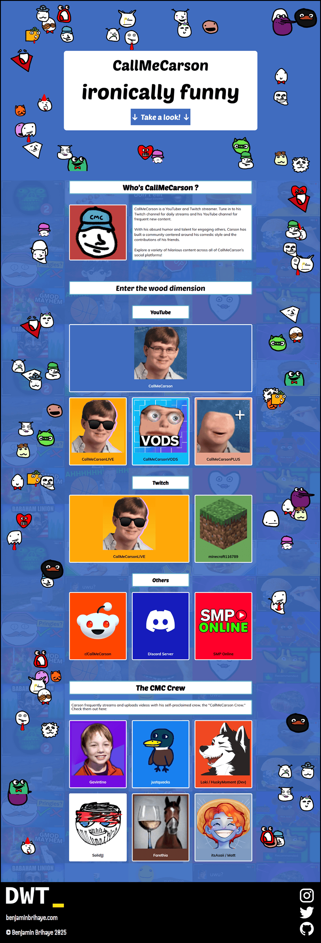
For the moodboard, I decided to use assets of CallMeCarson’s YouTube channels, his logos and banners. Colors comes from the YouTube assets and his official website. The logo is his official one. For the fonts, I used Poetsen One (which is the one he uses to subtitle his videos), and Muli (which is his website’s font).
Assets
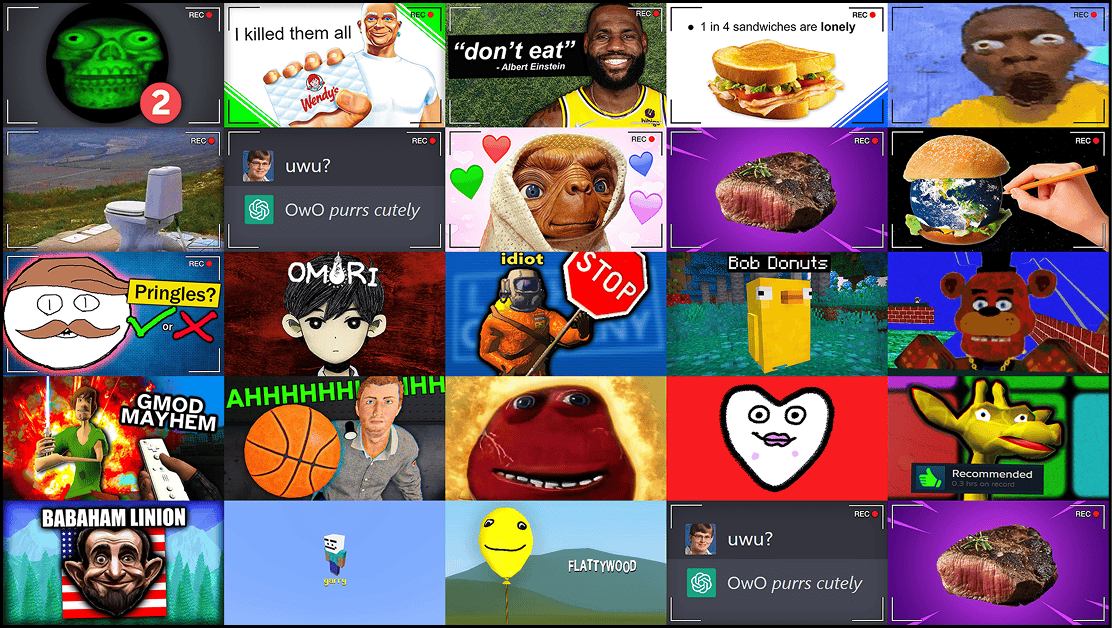
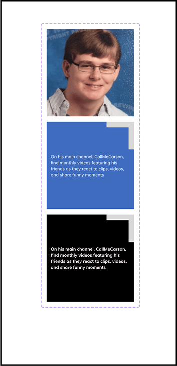
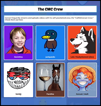
I used a compilation of his YouTube thumbnails to use as a background image on the website and break the plain blue background.
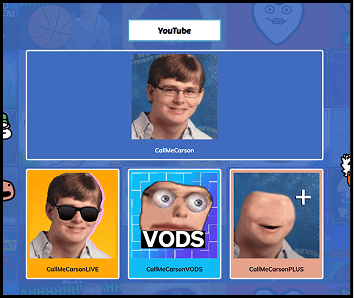
For the buttons linking to his socials, I decided for it to be mainly designed around his socials’ logos, as this is the most recognizable part of his channel, and a part of his personality. So each button contains the logo and the name he uses on this account. Hovering on the button will display a description on what he does there.
Iterations
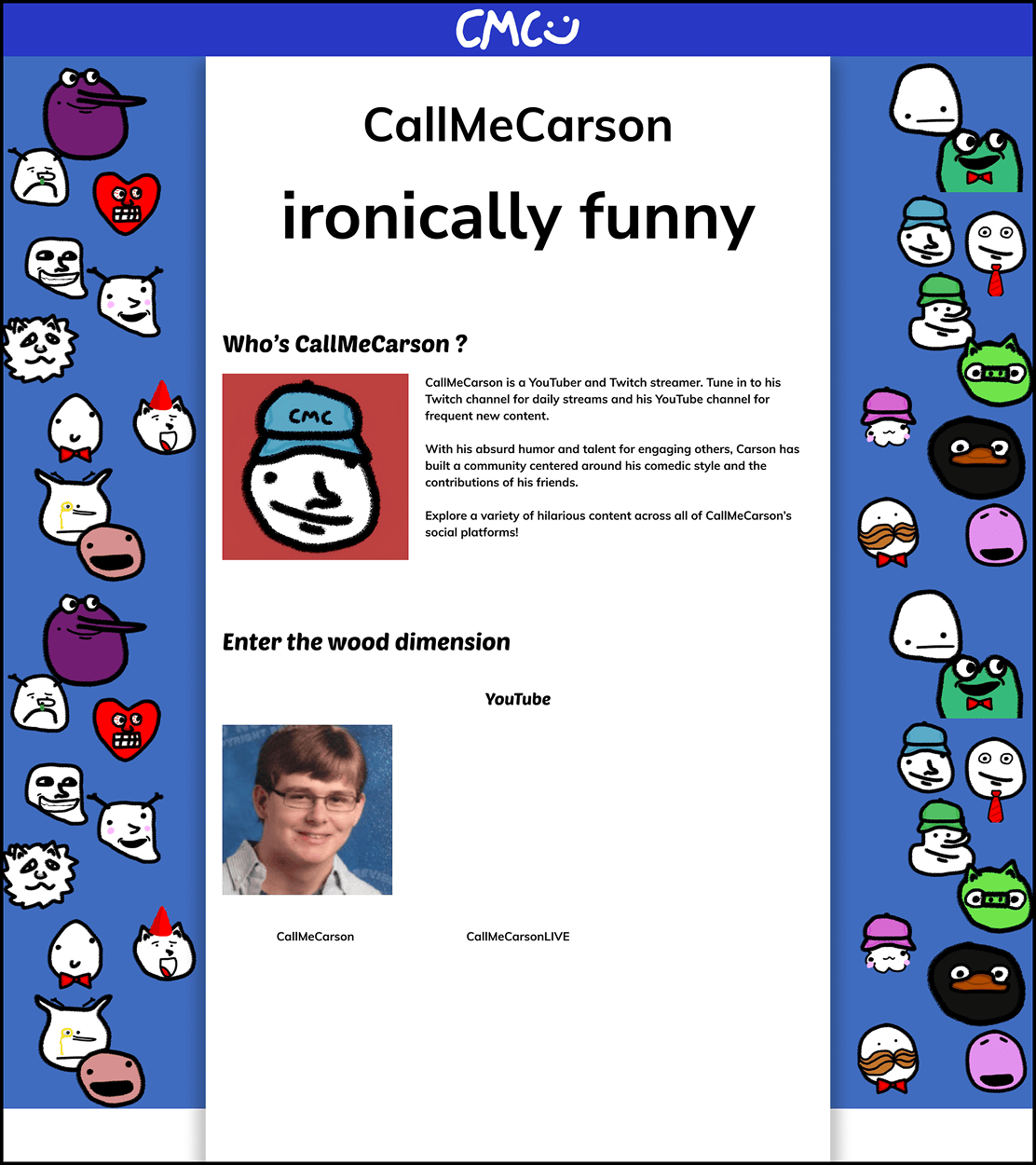
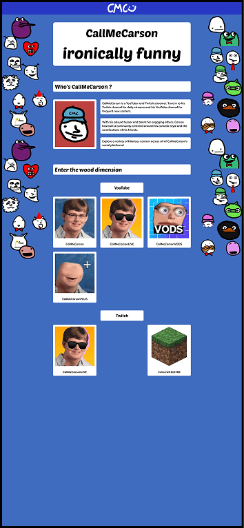
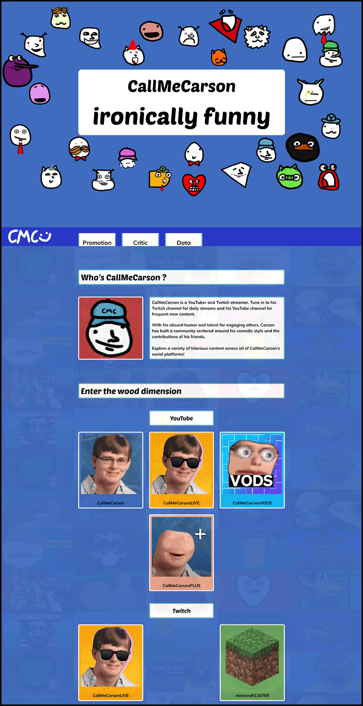
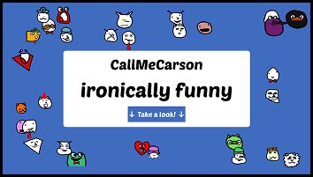
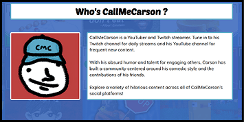
From the first draft, I decided to clean the area. On a designer side, the plain white section on a plain blue background was ugly. I decided to separate everything in different sections, so the user could breathe between them. It is also more easily readable because each sections stands out more.
But the buttons also felt to white, so I decided to color them with the primary color of the logo it is tied with.
Final Design
Project Dataplay - McDollars
2025, fetch and JavaScript developer
Project Dataplay was a school project centered around the use of data to create an interactive experience. McDollars is centered around the Big Mac Index, the cost of its ingredients, and whether it relates to global inflation.
Moodboards
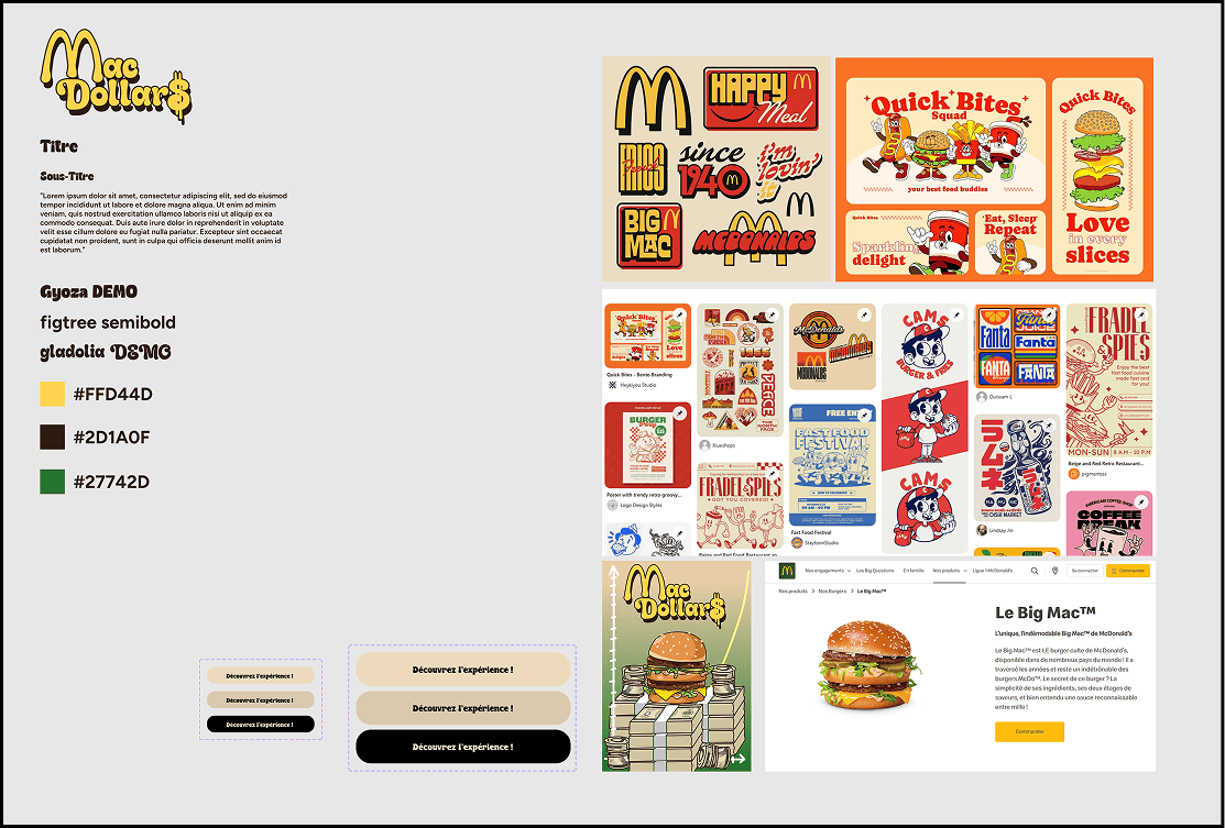
The first moodboard is targeted towards our art direction. We wanted something that feels retro and that reminds people of McDonald’s and money. We used the Burger King font which gives a retro 1970’s vibe. And we used some assets to create a really good retro art direction.
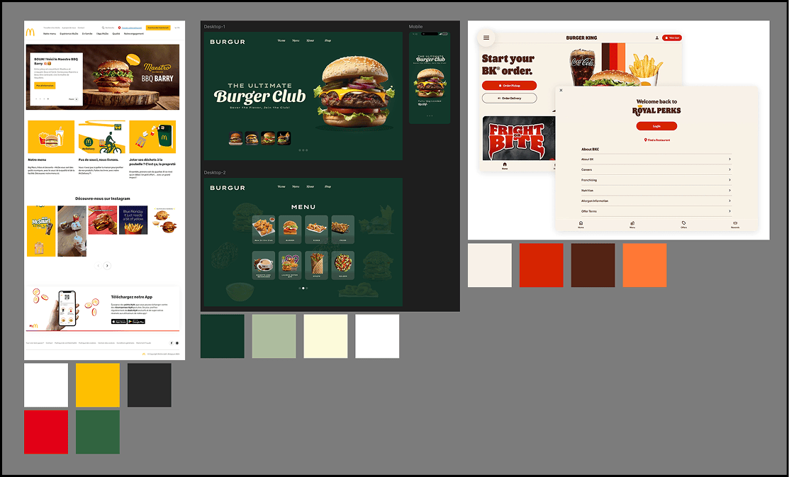
The second moodboard was for the website. We had to make a choice, either inspiring us from fast foods website. Or inspiring us from the ordering terminal’s interfaces.
Designs
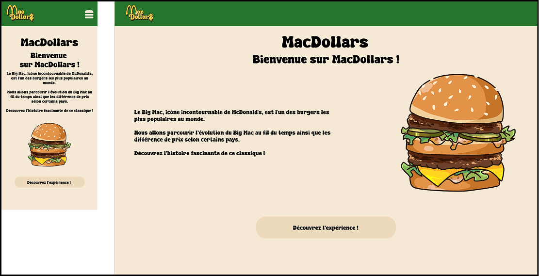
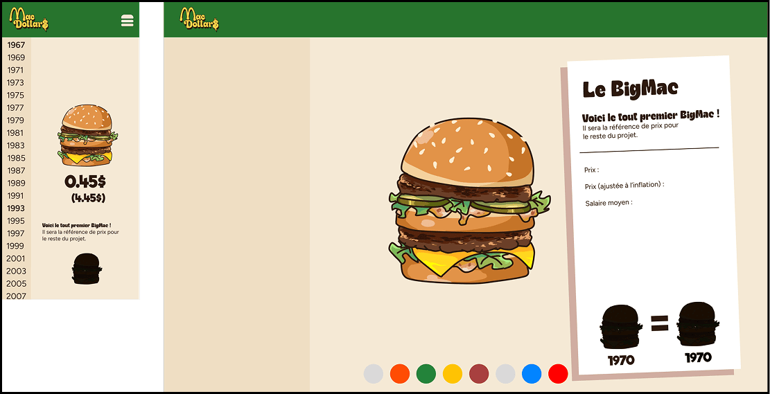
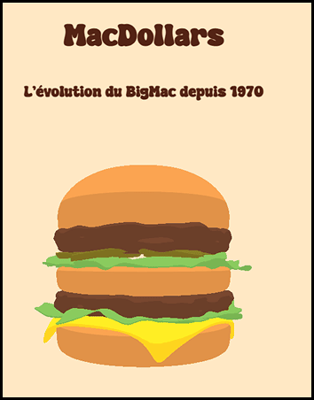
We decided to present the website in two parts. The first part present the project and the website, giving context for users. When scrolling, it also show graphs of the raw data we collected.
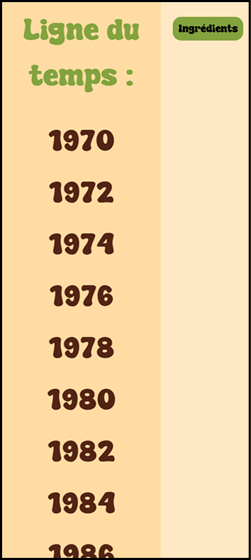
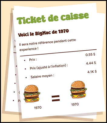
The second part appears after clicking the button in the first part. On the left, the would be a listing of dates, listed as to look like the left side of an ordering terminal. On the right side, there is the ticket, which show the data for the selected year, and a visual assistance (how many Big Mac of the selected year would you need to buy today’s Big Mac).
Final Design
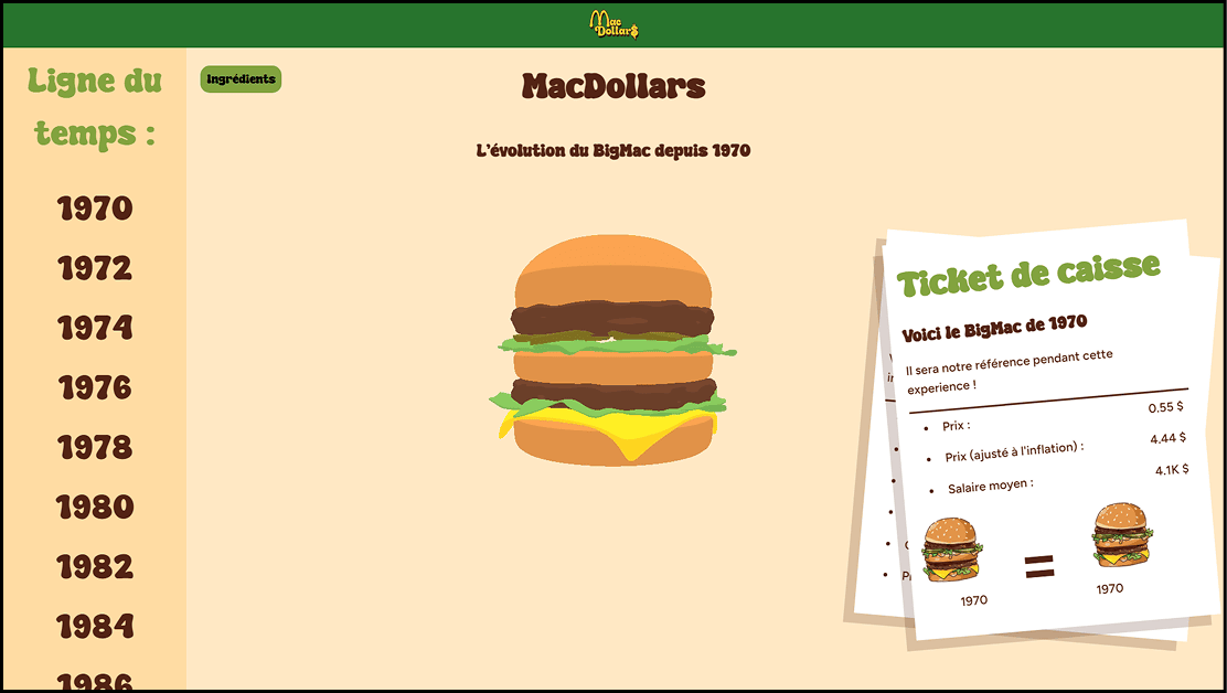
TFE - SideQuest-OMORI
2026, lead designer and lead developer
This project is a tool created to help OMORI players through the map of the game and help them complete their side quests through an itinerary concept showing the way through the map and showing the interactions.
Before OMORI
Before choosing to make my tool about OMORI, I was first tempted to make a website explaining the universe of Evangelion. I did not continue on this path given the fact that I wasn’t done with watching the series. And also that my understanding of it might have been limited.
Moodboard
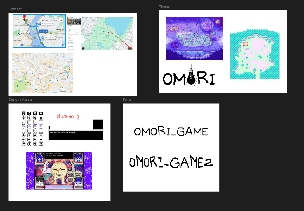
The moodboard pretty much gives the idea of what I was going for. I wanted a website where you could travel the map of OMORI like you were in Google Maps (dragging to move in the map and have an itinerary), combined with the assets of the game (maps, arrows, dialog box, font, etc.).
Design and assets
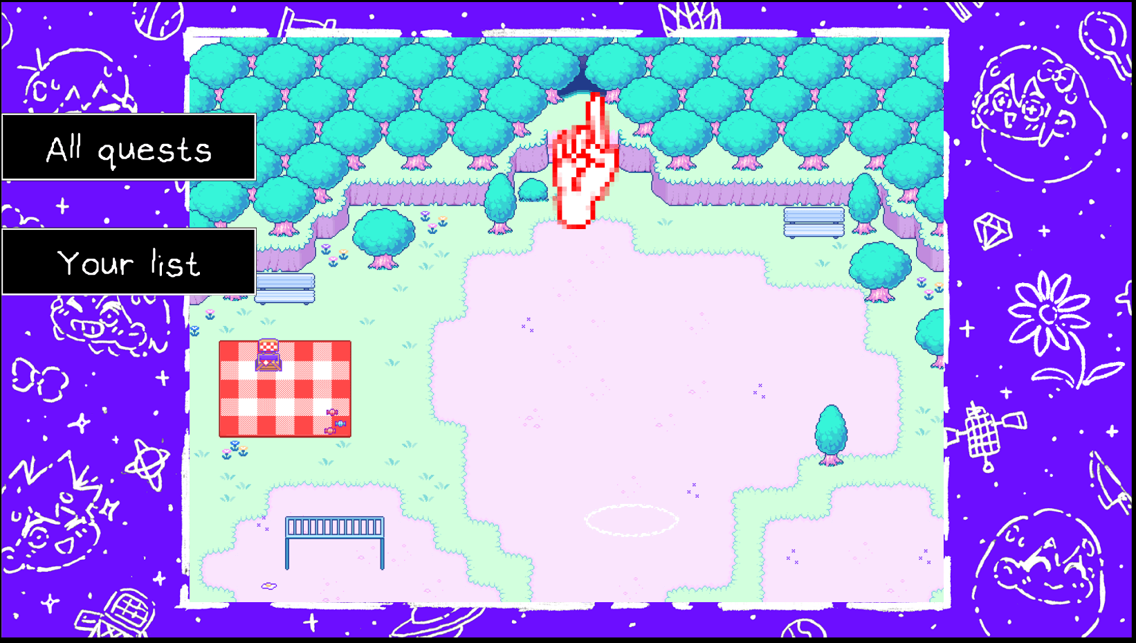
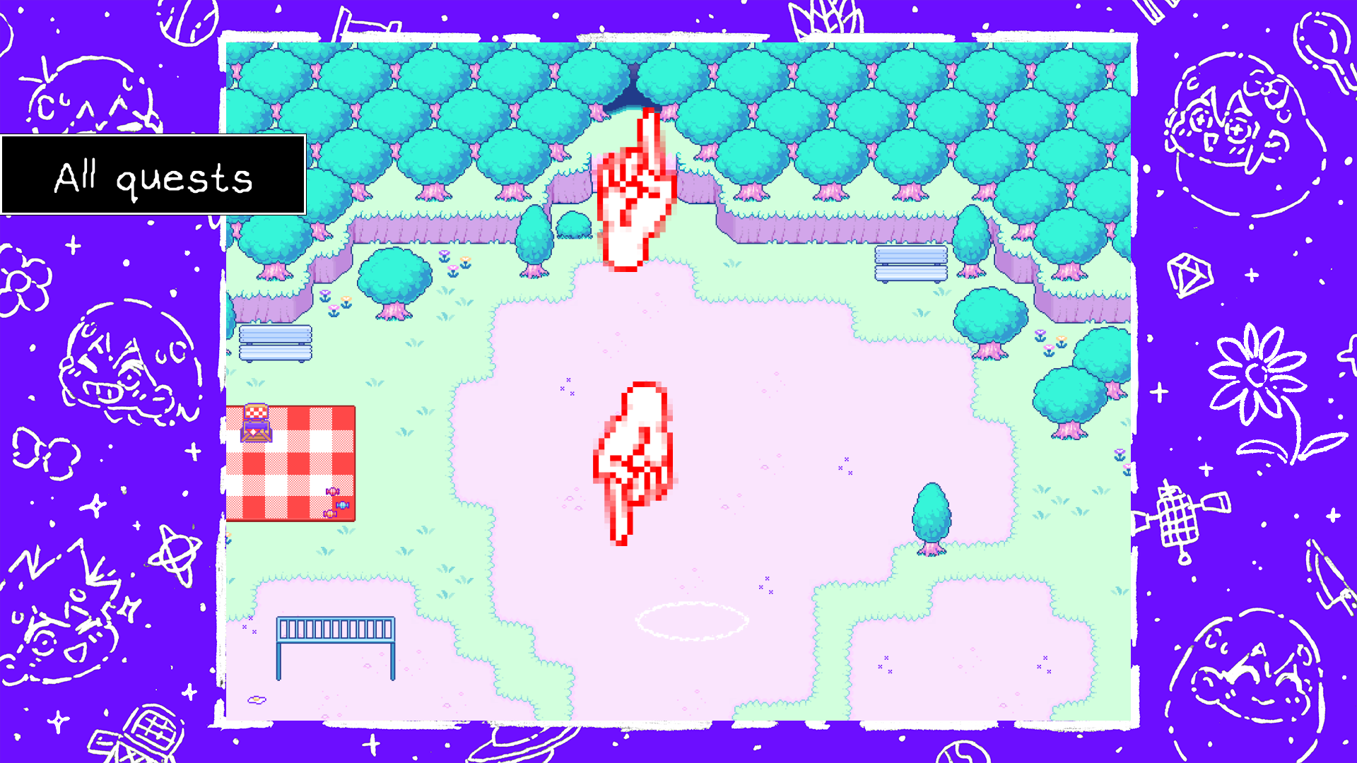

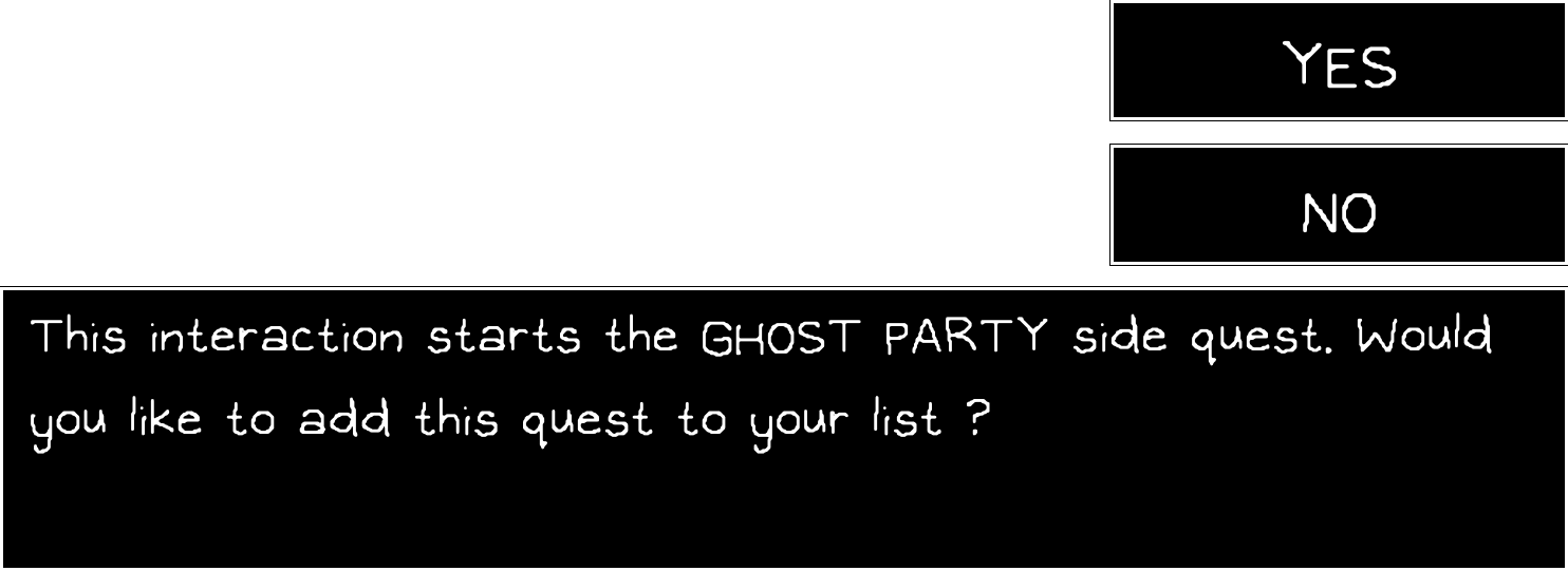
As you can see from the first 3 pictures, these were the first versions of the design. The background was different. And on the second screenshot, you can have a glimpse of the compass system that the user would see pointing in the direction of the next step.
And the third screenshot is a picture of the first designed starting form where the user would answer questions about their progression in the game. I decided to change this design afterward for something that looked like it belongs to the website, placing it in the middle of the map section before it loads.
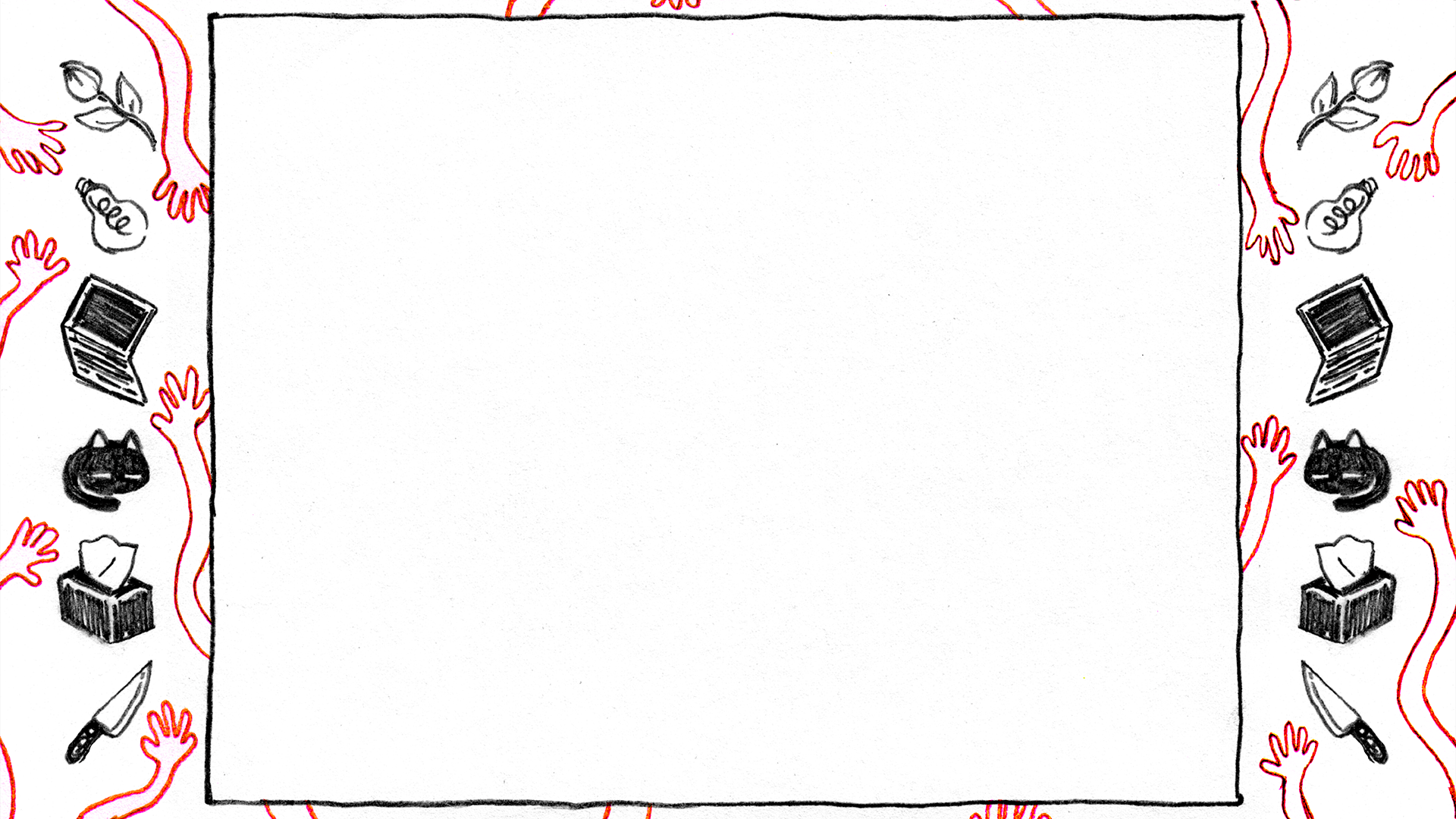
There are 2 versions of the game: a PC version and a console version. The PC version has a screen ratio of 4:3. But for the console version, the OMOCAT studio had to expand the ratio to 16:9. So, they added a background taking up all the space, while the game was in the middle, still at 4:3. I took these backgrounds and used them for my website: a background all over the space, with the experience in the middle as a square.
I remade the OMORI dialog box by myself in Figma and created multiple instances of my experience to see if moving on the map and changing map was possible.
Development
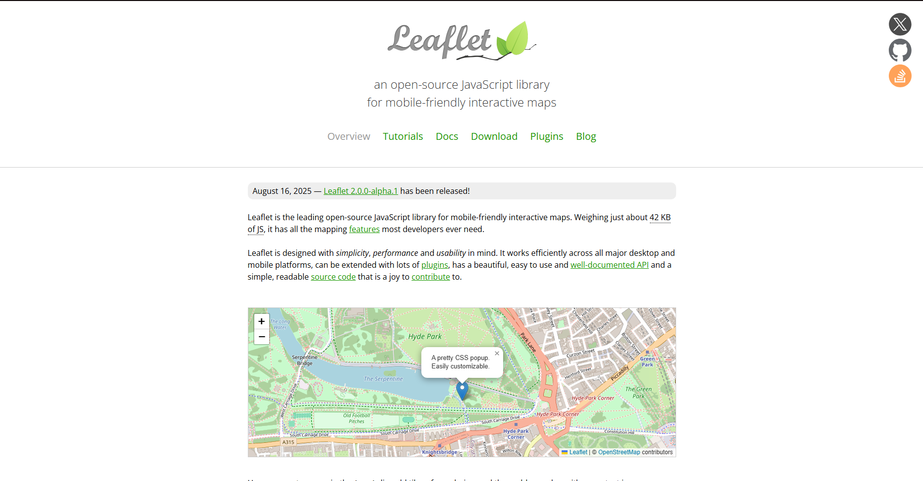
For this project, I used a JavaScript library named Leaflet. Leaflet is a popular library used for creating interactive maps. Ding, ding, ding, that’s exactly what I needed. And in fact, you can import custom images as maps, markers, or interactions.
So, I first downloaded every image I needed for the map, and created a JSON that would contain all the info needed by Leaflet to adapt the map. I chose to use JSON because of the number of maps needed, it would’ve looked untidy in JavaScript.
For each map in the JSON, I had to write: the name of the map, the path to image, its size, then the “exits” (markers for changing map) with, for each exits, its coordinates, where it leads to, and the coordinates where it should takes us in the next map. There’s also an “interaction” part for maps where an interaction for a quest is present: for each interaction, its name, the path to the image and its coordinates (difficult part as you have to put two sets of coordinates tied to the coordinates and the size of the image).
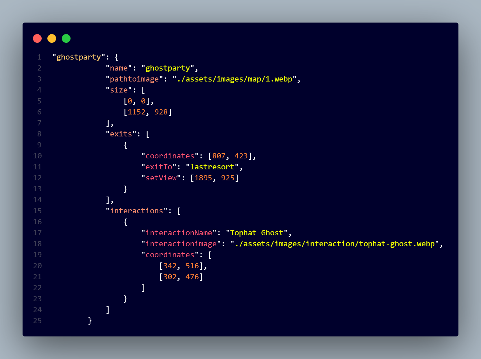
All of this is imported in the JS where I can play with the conditions: depending on your progression on the game, some quests are not available to do, some parts of the map are not available, etc.
So in the beginning when joining the site, I decided to add a little form to know exactly where in the game you stand. I made a little settings box so that you can change your answers later on. Everything you do is stored in the LocalStorage (current map, location on the map, and your answers to the form, your current quest and your current step in this quest), so, when you go back on the website, you are just exactly where you left from.
The Quests
Now for the quests, I regret I can’t show any code because it’s too long. I had two options, either I try making an algorithm I didn’t know about two weeks before the project’s due date (Breadth-finding path), or either code something I knew I could do but it would look terrible in the JSON.
But for the time I had left, I decided to go for the latter. For each quest, I had to do every step of the quests. And for every step of the quest, I had to write, for each single map, where the player needed to go and a splash text to help the player find the path. For your information, one step for one quest was about 300 lines of JSON.
Now the second problem I had was that, at the beginning of my project, I wanted an arrow pointing to the exits people had to take for their quests, wherever they were on the current map. And I found what I thought to be a nice little Leaflet plugin named Leaflet.EdgeArrows. Long story short, it doesn’t work quite well, even though I thought it was. The arrows were visible in some map, but not on all maps. Which is pretty inconvenient given the fact that some of these maps are gigantic. So I gave up on that idea and stuck with a different colored arrow on the exit and a splash text to navigate the user.
Final Design
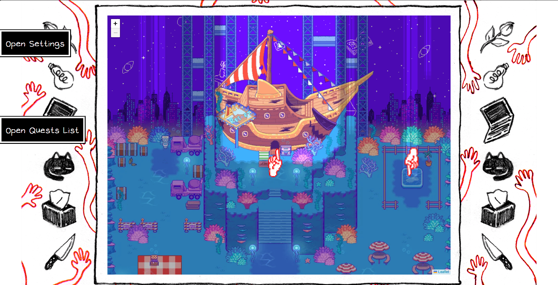
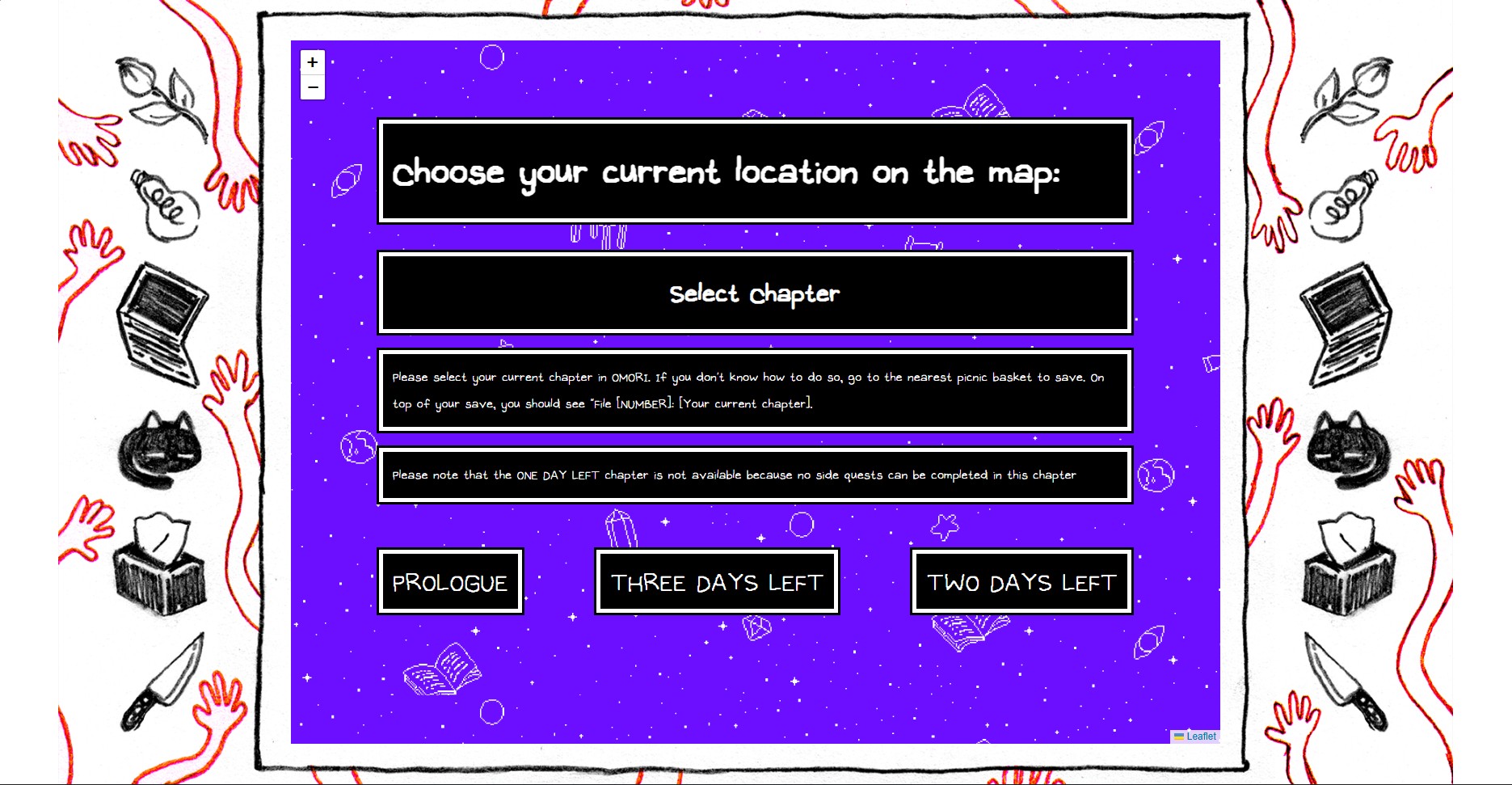
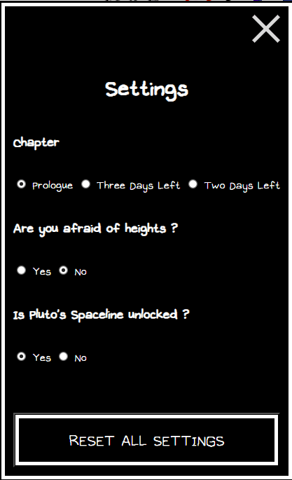
After changing the background and some other steps, SideQuest-OMORI was done.
In the beginning, the website will ask you for some information about your current progression in the game because some parts of the map and some quests might not be available. But don’t worry, you can still change your information later with the "Settings" box.
After that, you can freely explore the map of the game as if you were on Google Maps. You can drag to move, you can zoom or de-zoom, click on exits to change location, use Pluto’s Spaceline to teleport to a different area, etc.
And also available, the itinerary option. Click on “Open Quest List”, choose a quest, and the website will tell you where to go and additional instructions if needed.
This is the perfect tool to use on a secondary monitor while you're playing on your main screen.
If you fail to find the path for your side quest, don’t hesitate. Use SideQuest-OMORI to find your path.
TFE - SideQuest-OMORI
This project is a tool created to help OMORI players through the map of the game and help them complete their side quests through an itinerary concept showing the way through the map and showing the interactions.
VISIT WEBSITE
Project iLab - Grind
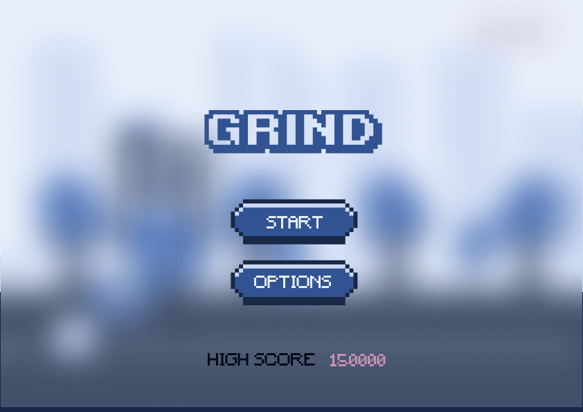
iLab is a project about creating a game about disabilities. For Grind, we choose obesity. In Grind, you walk forward on an infinite map, avoid bad habits and monsters, and become fit. The game was made using Construct 2.
 VISIT WEBSITE
Project Janus - CallMeCarson
The purpose of this school project was to create a website about an influencer. To make a page promoting him, then one talking about the influencer controversies and problems, and a page displaying his data.
VISIT WEBSITE
Project Dataplay - McDollars
Project Dataplay was a school project centered around the use of data to create an interactive experience. McDollars is centered around the Big Mac Index, the cost of its ingredients, and whether it relates to global inflation.
VISIT WEBSITE
Project RUX - Lay Out Your Layout
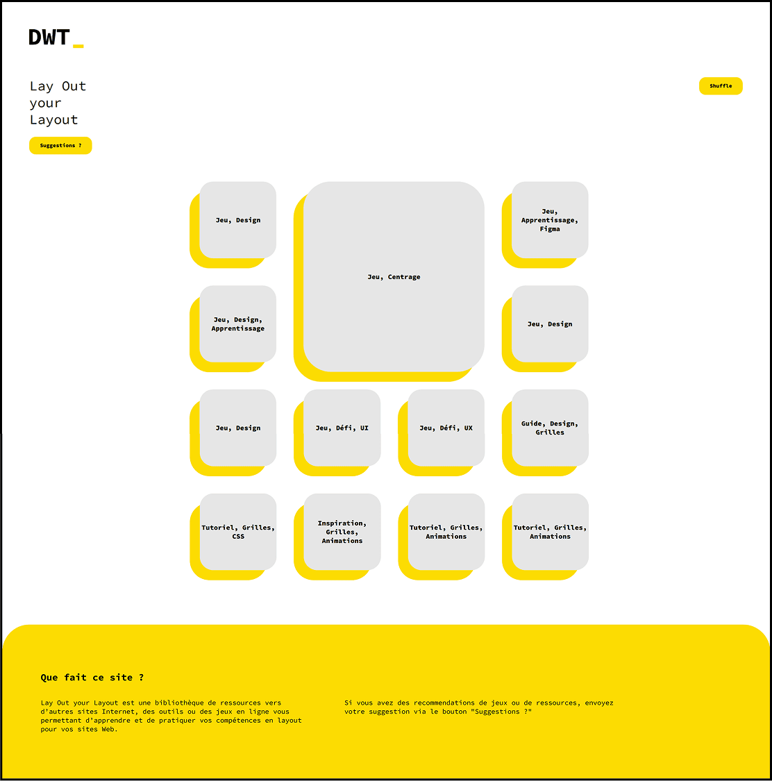
Lay Out Your Layout (LOL) was part of Project RUX, a project targeted at improving the Web Design classroom a better place to study. LOL is a website made into a terminal, it is an index of websites that students could use to improve themselves in any area of Web Design
 VISIT WEBSITE
Project Decembre - La Main Gauche de la Nuit
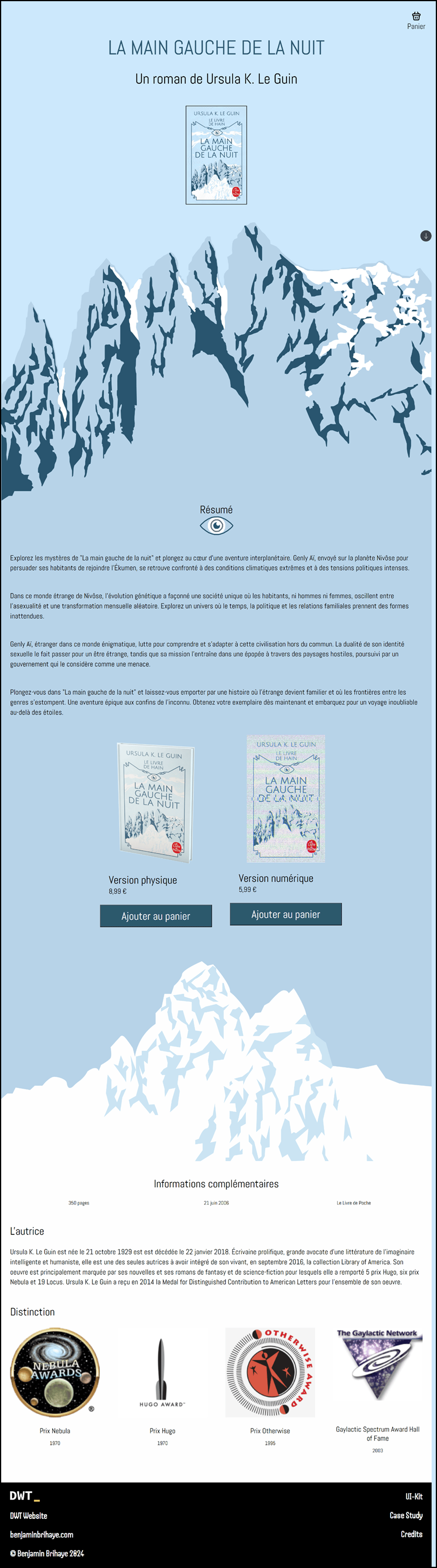
Project Decembre was a project targeted at creating a landing page to buy a product, which we had to choose from a list. My project was around the book “La Main Gauche de la Nuit“ Ursule K. Le Gain.
 VISIT WEBSITE
Project Design Fiction - KEB
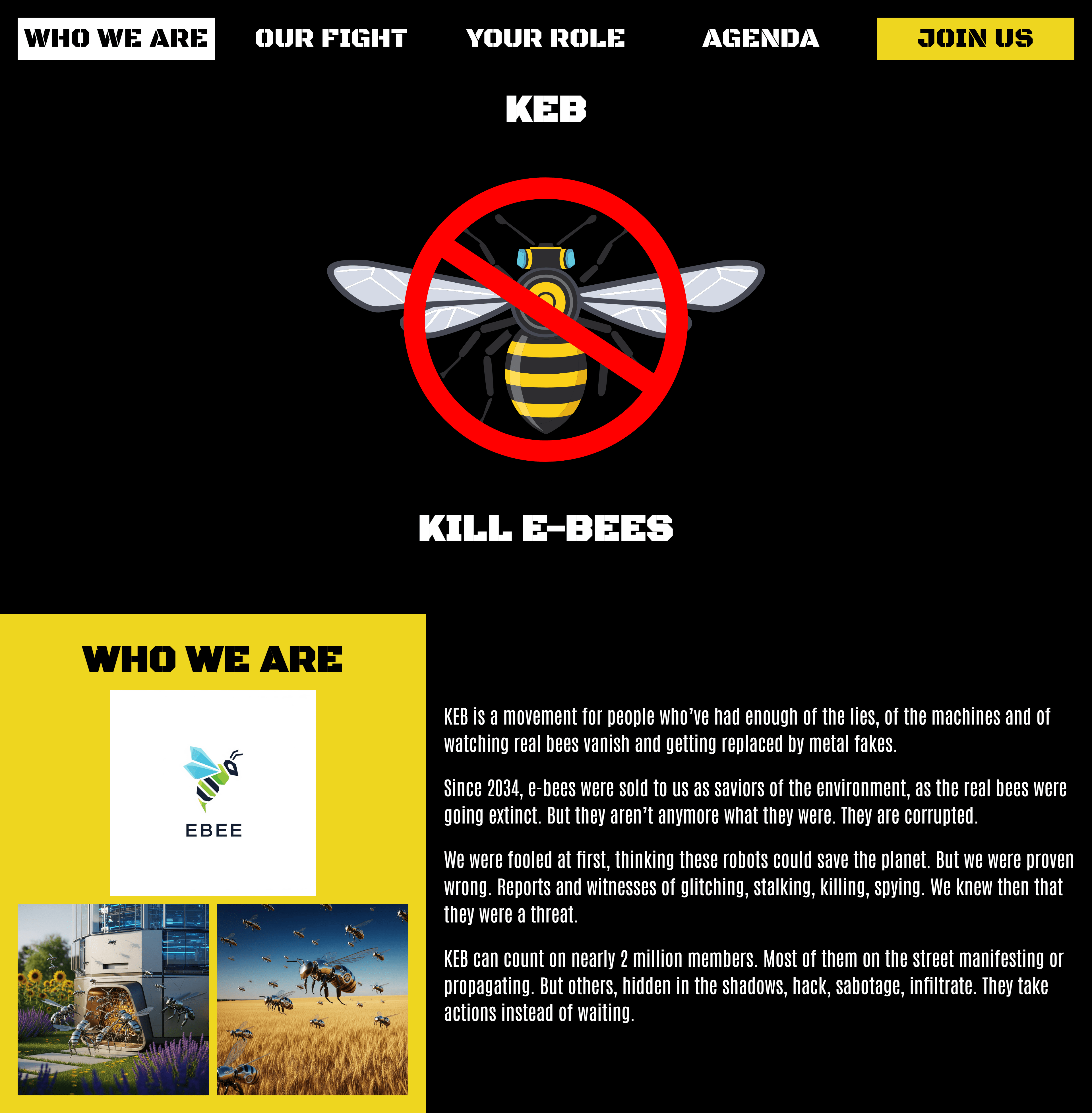
Project Design Fiction is a project asking us to think about an idea from the near future and doing a website about it. I decided to do something about robotic bees. KEB is a fictional website about a rebel group against those robotic bees.
 VISIT WEBSITE
Credits
Homepage
- background image by @frogapples_ on X. (https://x.com/frogapples_/status/1054322555203403777/photo/1)
- Arrow button taken from Iconify on Figma
- Favicon by @drillramen on X. Original Character Design by OMOCAT. (https://x.com/drillramen/status/1558137425444368384/photo/1)
- About Me image by @smokiant on X. (Original post deleted)
- All images related to project Janus are from my website (https://www.benjaminbrihaye.com/projets/janus/). Some images there come from other sources.
- All images related to McDollars (or project Dataplay), come from my website (https://www.benjaminbrihaye.com/projets/mcdollars/). Assets in that website made by Pearl Bondele.
- All images related to LOL (or project RUX), come from my website (https://www.benjaminbrihaye.com/projets/lol/)
- All images related to La Main Gauche de la Nuit (or project Decembre), come from my website (https://www.benjaminbrihaye.com/projets/decembre/). Some assets are official assets of the book.
- background image of the “ABOUT ME” button is a promotional GIF made by Steam for the Autumn Sales 2024. Image can be bought with Steam Points at this link (https://store.steampowered.com/points/shop/app/2861700/reward/342134)
- background image of the “CASE STUDY” button comes, as far as I’ve found, from Tenor GIF by AsyaTheAlienn (https://tenor.com/fr/view/pixel-study-gif-20419806)
- background image of the “PROJECTS” button made by Gustavo Pinto Vilas Boas on ArtStation (https://www.artstation.com/artwork/blJqmr)
- background image of the “CREDITS” button comes, as far as I’ve found, from Tenor GIF by SchtroumpfAssassin (https://tenor.com/fr/view/hideo-kojima-credits-video-game-gif-14466133)
- Bee from the Design Fiction button animation comes from Vecteezey (https://www.vecteezy.com/png/52645116-honey-bee-top-view-for-pollination-illustrations-on-transparent-background)
- ChatGPT used for a “position: sticky” for the navigation. Prompt (Comment faire pour que la longueur d'un élément en "position: fixed" soit toujours relative à la taille de son parent ?)
- ChatGPT used to stop links in credits from getting out the window "word-break: break-all". Prompt (en CSS, comment faire pour que les liens a ne sortent pas de la fenêtre)
- ScrollTop buttons. Code copied from w3schools (https://www.w3schools.com/howto/howto_js_scroll_to_top.asp)
Design Fiction
- Text written by me, then corrected by ChatGPT, then rewritten by me. Example prompt (Voici un texte que j'ai écrit. Dans le prochain message, je t'enverrai un autre texte. J'aimerais que tu l'adaptes au ton du premier texte. // Text //) -> (Voici le second texte : // Text //)
- KEB Logo generated by the Photoshop AI. Prompt not determined.
- All images are AI generated by Google’s AI Gemini.
- ChatGPT used in code for an ‘active’ state. Prompt (//code // Pourquoi mon "li" avec la classe ".active" ne reçoit pas le style ?)
- ChatGPT used in code for a div in “height: fit-content” that wasn’t fitting to content. Prompt (//code // Je possède cette div avec une image à l'intérieur, la largeur est bien adaptée au contenu, mais la hauteur est légèrement plus grande. Pourquoi ?)
- ChatGPT used to make multiple vertical header. Prompt (//code// Je veux changer le letter-spacing du h3, mais à chaque fois que je l'augmente, la tailel de".sectionHeader" augmente aussi)